Invezz

It is a popular investment platform with over 1 million monthly visitors.
We had to enhance the look and functionality of the website to improve user experience, boost conversions, and increase engagement with sponsors.
#platform
#investment
Invezz
Location
Great Britain
Our role
Web design
Project duration
09.2020 - 11.2022
Type of work
Time and Materials

Background

The client chose our outstaffing UX/UI services to get the full redesign of the website. The Invezz financial platform had an enormous following, but the design was very obsolete.

The users got used to the old design; nevertheless, it was about time some modern changes were made. The goal was to enhance conversion rates and interactions with sponsors. The client wanted a redesign that would make users engage while making the website look visually appealing and functional.

Tech Stack
Figma
Number of sprints
3

Tasks and challenges

What we had to do

The platform already had a huge user base, so the main challenge here was rebuilding the website without losing its hard-won users. Users had grown accustomed to the old design, and modern improvements would need to be implemented in such a way that the underlying structure was still familiar for ease of transition.

We should implement changes in an iterative and thoughtful manner. The gradual introduction of design updates allowed us to take care of user feedback and ensure that the new design met both functional and aesthetic goals, improving both performance and user satisfaction.

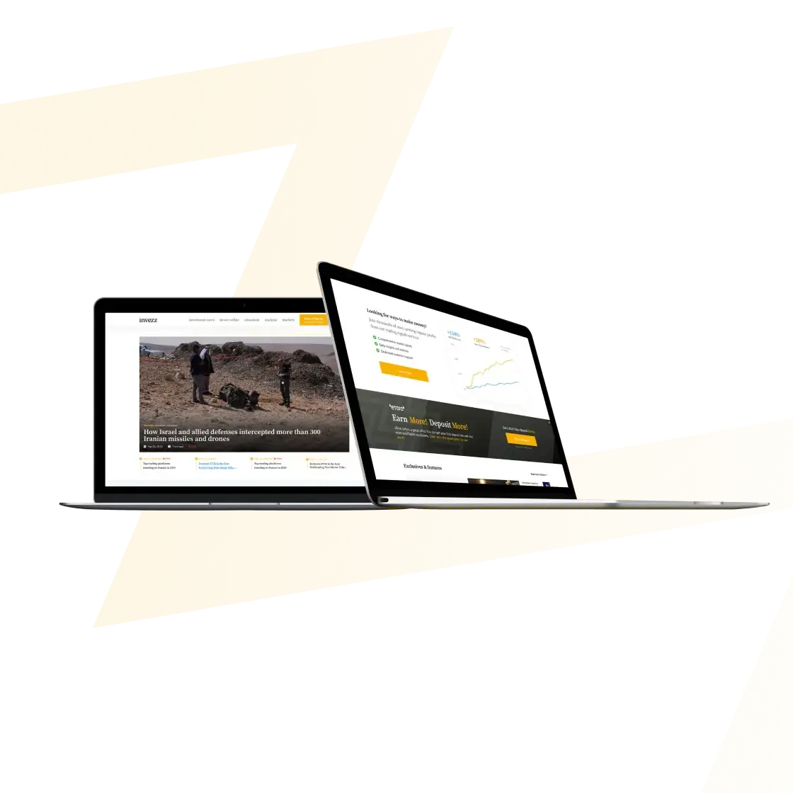
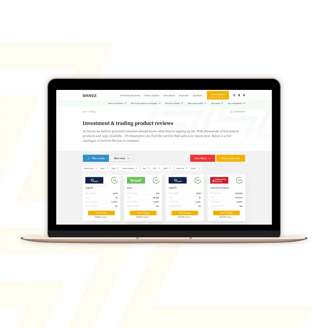
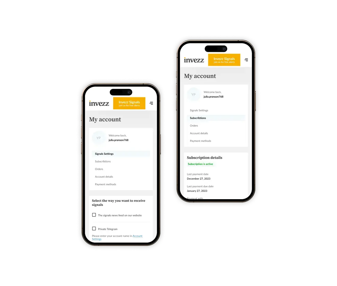
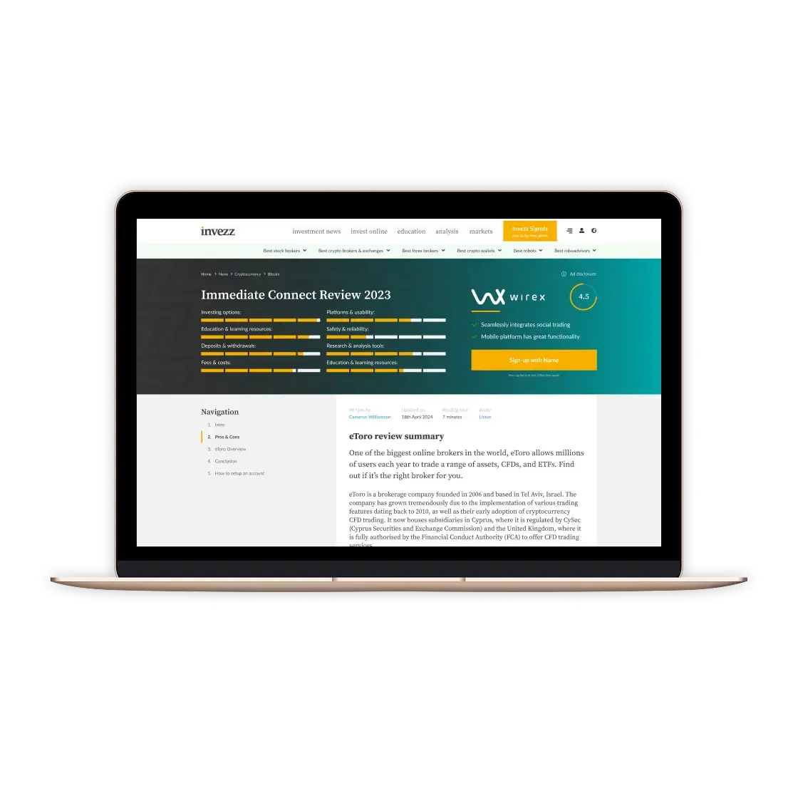
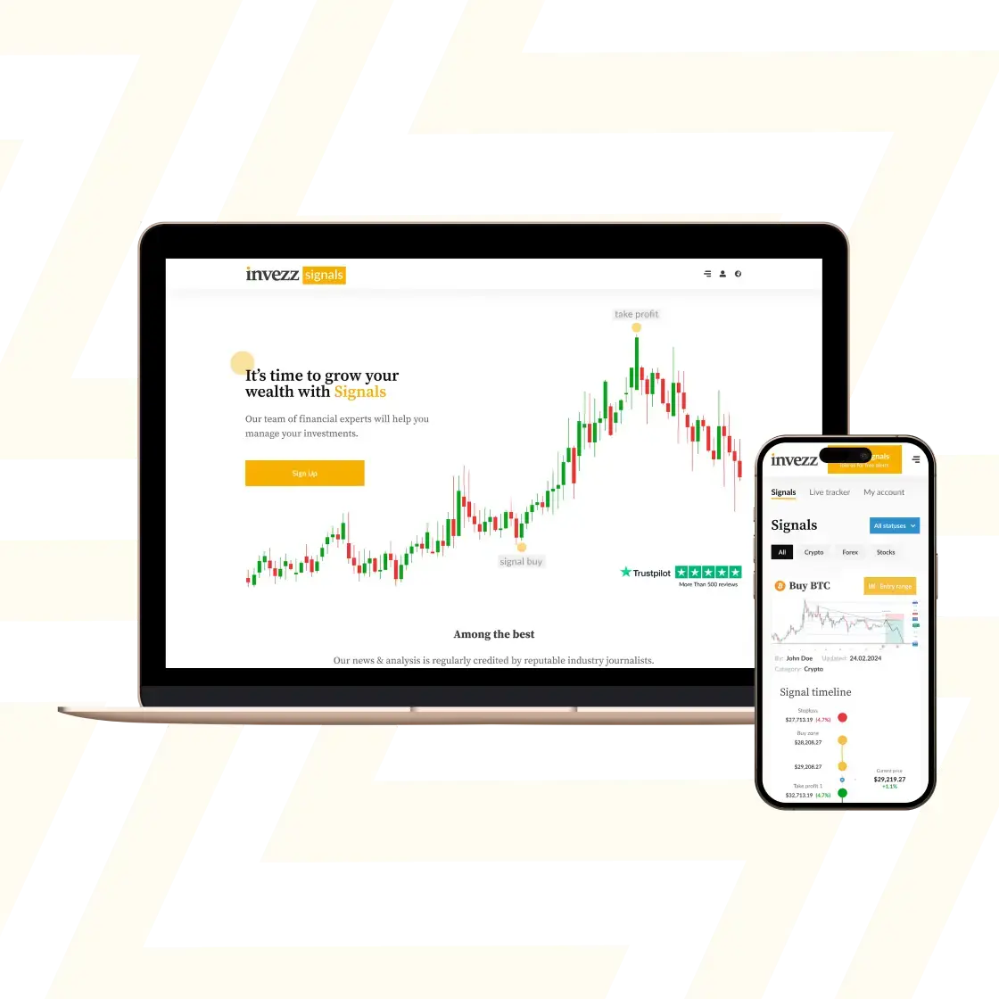
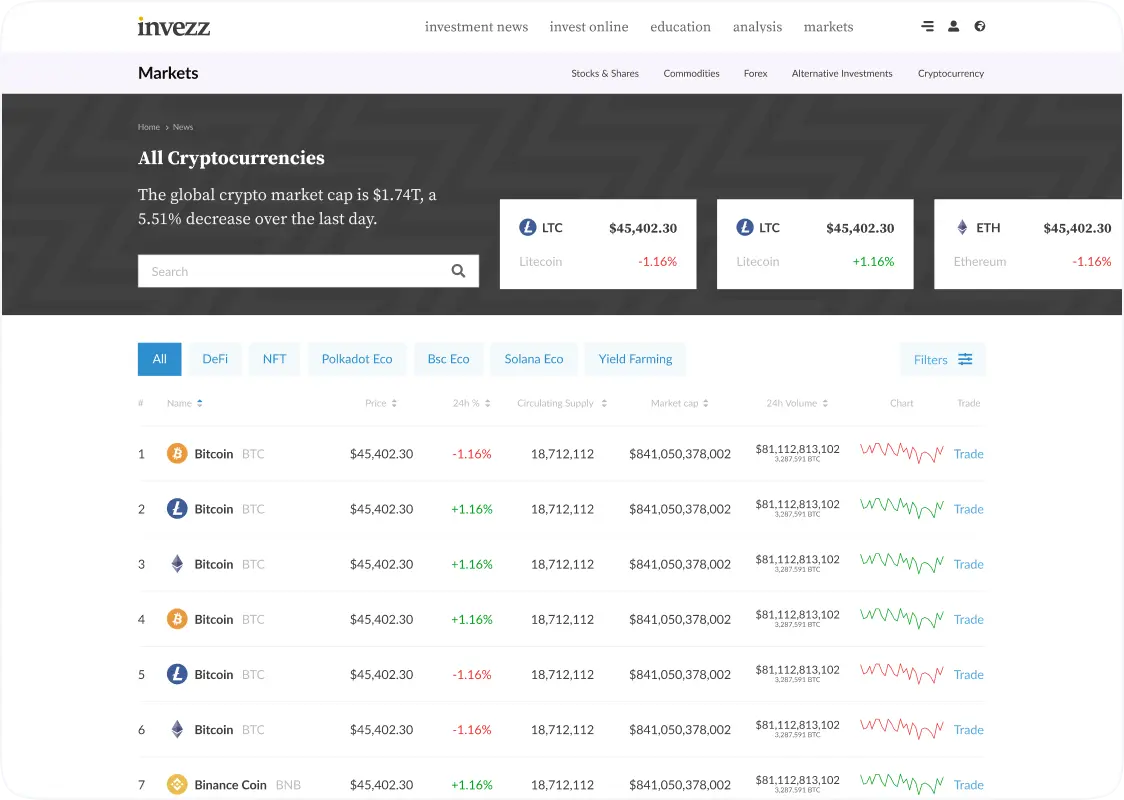
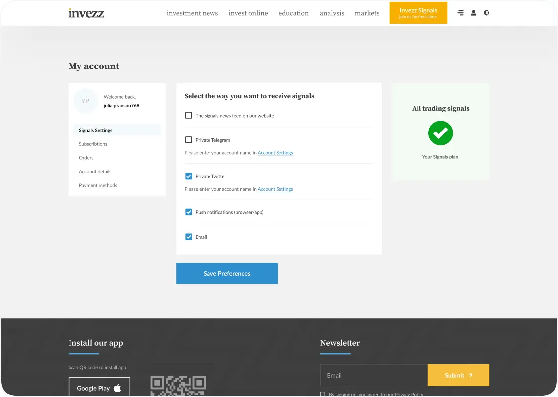
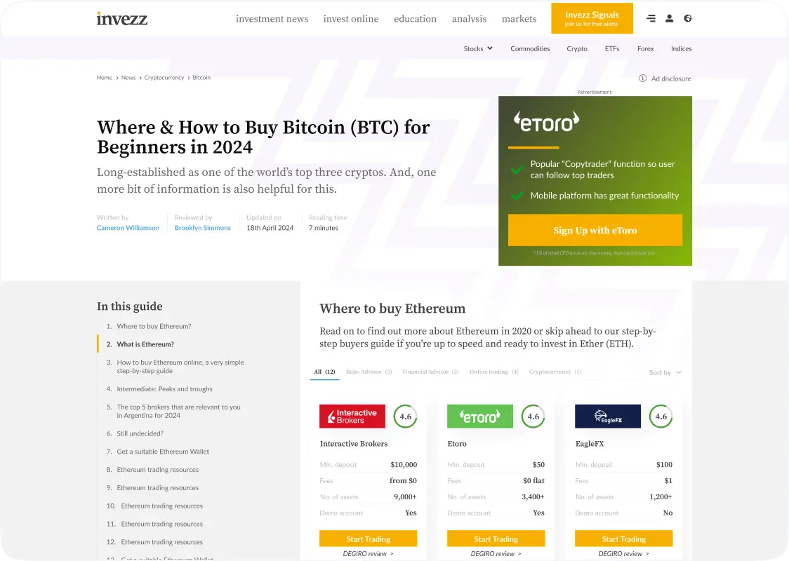
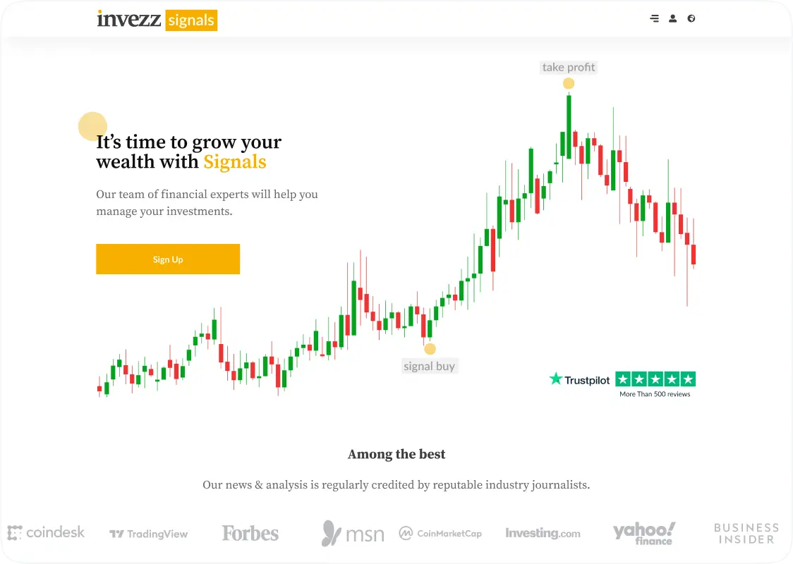
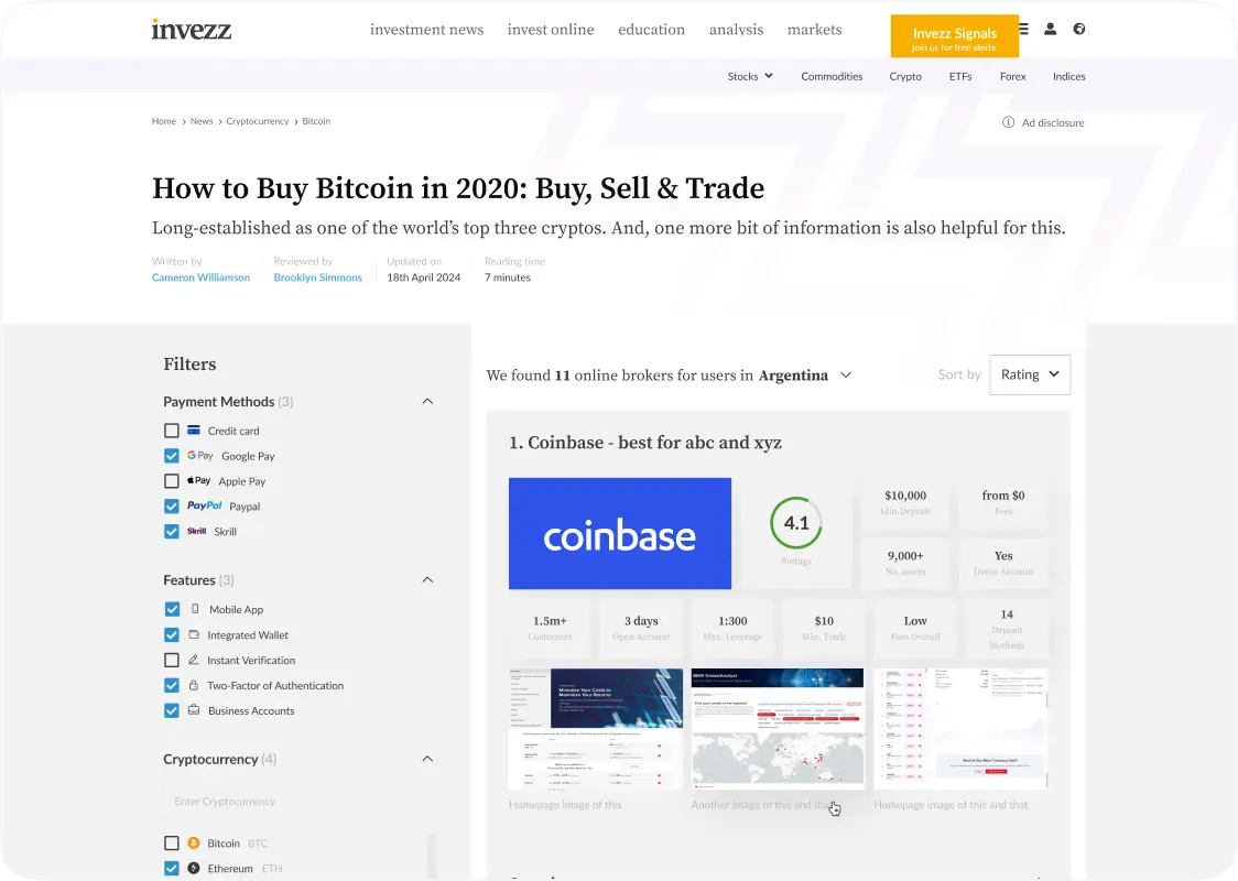
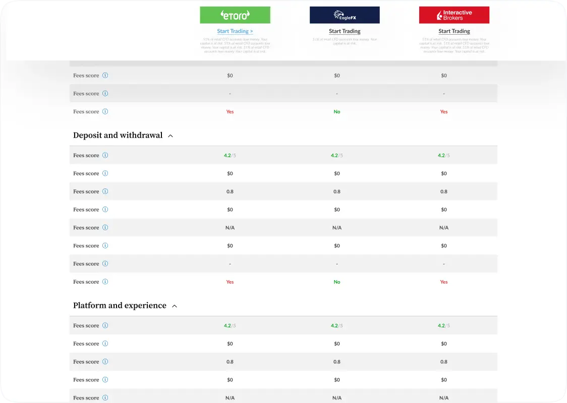
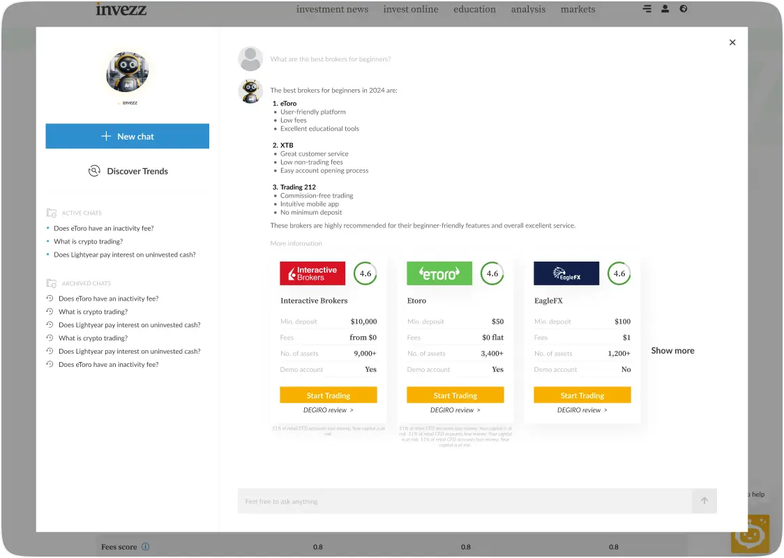
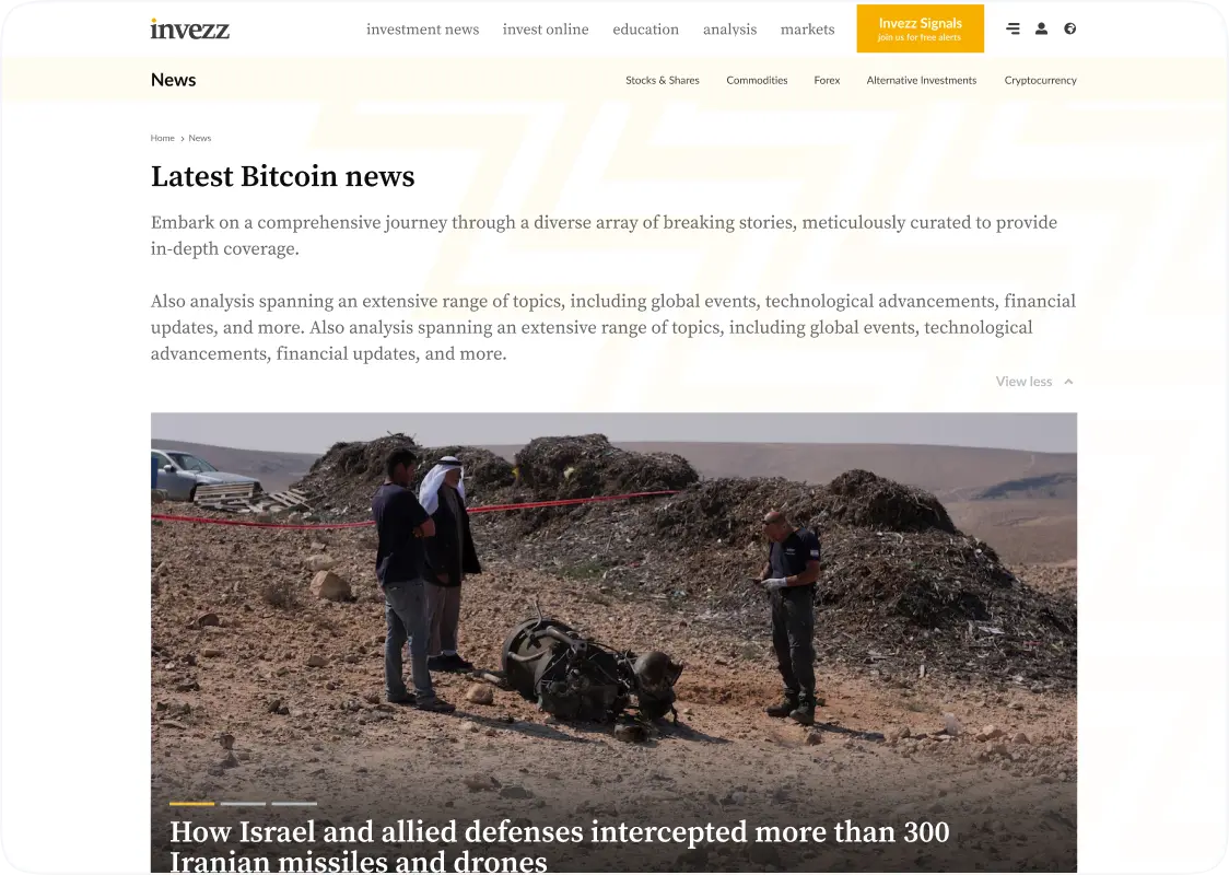
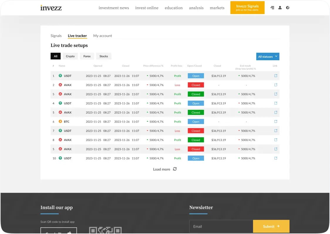
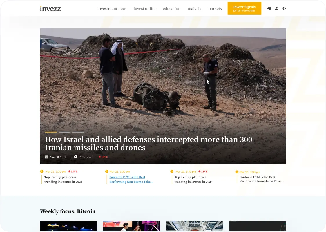
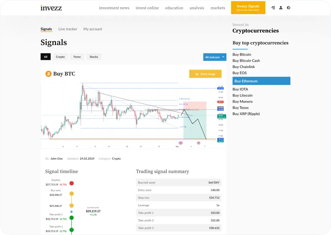
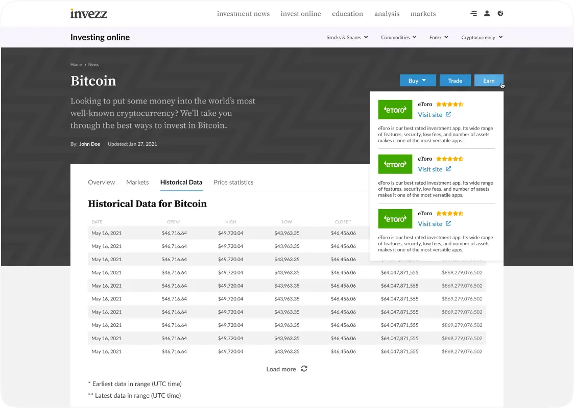
The core requirements for the Invezz platform are to design the main page (including hero sections), project catalog, account settings, blog section, signals for informed financial decisions, and improve other pages.

  • Redesign the website’s look and functionality
  • Improve the design without changing the user experience too much
  • Create a sponsor-friendly layout to increase engagement
  • Retain the user base through gradual changes
  • Ensure smooth navigation and performance
  • Balance old user design expectations with modern features

Need a reliable partner to develop your web product?

Get started on your successful project with our team of experts.

Screens

Solution

What was done

We initiated the project with a thorough discovery phase, including competitor research and the creation of a Lean Canvas model to guide us in our work. From there, we moved on to designing a new user interface using Figma.

Several design iterations were made, where at each point in time, the client was consulted. We had to make sure this new design was going to serve business goals.

The new, fresh look combined sleek visuals and clean typography for the website. More engaging, the designs have become easier to use. This enhanced the user engagement. The re-design also offered valuable sponsor content thanks to better placement and visual hierarchy.

  • Improved visuals
  • Increased user interaction
  • Optimized performance

our point of view

It was important to modernize the website but keep the user experience familiar for old users. We improved functionality, performance, and engagement for sponsors without breaking what the users were used to. Careful iteration and close collaboration with the client helped us a lot to make the right decisions to achieve the desired results
Dima
Dima
CTO at Peiko

Take a closer look

Updated main page
We redesigned the main page and created striking and bold hero section with clear visuals down to the call-to-action buttons. Easy access to important content using intuitive navigation was ensured.
Enhanced project catalog
Peiko’s UX/UI designer renewed the catalog using a modern look that enhances both project information conveyance and users' flow for perusing projects within. More categorization and filtering made the users get the information they needed faster.
Renewed account settings
We designed a completely renovated account settings page with easier handling of user information. Adding more intuitive design in access so that modification in account details is effortless to work out easily.
Added a modern blog section
A new blog section was designed for better visibility of the content and ease of access for users to informative financial articles and insights. We enhanced structure with categorized blog posts, where users can navigate and find content that best suits their needs.
Optimized Signals page and other pages
The Invezz Signals page was remade with a clean, modern layout to visually show key market insights in a stimulating yet easily digestible format. Other pages throughout the site were also updated to include optimized content placement, and more intuitive user interactions.

How long it took

What the client got
480 hours
UX/UI implementation
Let's build something great together
abstractabstract
Choose an option here
Maksym Privalov
PRODUCT MANAGER, SENIOR BDM
Privalov
star
Share the basic information about your project — like expectations, challenges, and timeframes.
star
We’ll come back within 24 hours
star
We will sign the NDA if required, and start the project discussion
Peiko logo