


Why is mobile-first so crucial for successful digital projects? The global shift of web users from desktop to mobile devices is on the rise, and this trend appears to be ongoing. Therefore, it is logical for designers to prioritize the mobile audience when developing websites.
Implementing a mobile-optimized design strategy not only allows businesses to capitalize on the current surge in mobile usage but also positions them for the anticipated exponential growth in the years ahead.
If you are looking for the answer to what is mobile first design and how to implement it the best way, this brief is for you.
In this article, prepared by our skilled designers, we will explore the key points of quality mobile-first design. You will discover the practices we apply to create convenient and responsive software solutions, such as intuitive navigation, content priority, design-specific graphics, and more. Let’s get started!
Mobile first design: definition
Let’s start with statistics that confirm that a focus on the mobile version of applications is necessary.
During the final quarter of 2023, mobile devices (excluding tablets) accounted for 58.67% of total global website traffic, showcasing a dominance in the digital landscape.
As of 2023, the worldwide consumption of mobile data on smartphones averaged 20.37 gigabytes monthly, showing a notable increase from the previous years. Projections indicate a rise to 47 gigabytes by 2028.

We have given some statistical data as an example, and now let’s figure out what the best mobile first website design is.
The mobile first design concept allows web designers to initiate product design with a focus on mobile devices. This involves creating initial sketches or prototypes tailored specifically for the smallest screens and gradually scaling up to accommodate larger screen sizes.

It is practical to prioritize mobile design due to the space constraints inherent in smaller devices. This necessitates the prominent display of essential website elements for users on these screens. By beginning the design process with mobile devices in mind, teams can streamline the website’s layout and navigation, ensuring optimal rendering and usability.
Designing and developing for smaller screens encourages designers to eliminate extraneous elements that may hinder website performance or user experience. A site optimized for mobile devices typically translates well across other devices, including tablets, desktop computers, and laptops.
Key advantages of mobile-first design
A mobile first design approach prioritizes the requirements of mobile users. Such an optimized solution will be not only functional but also accessible and engaging. Below, we will discover the crucial benefits of adopting a mobile first design strategy.

More mobile traffic
With the rising use of tablets and smartphones, a mobile first responsive design ensures that it can adapt to different screen sizes and resolutions. This means visitors can access your site easily from any device, resulting in a broader reach and potentially more traffic from mobile users.
Boost for SEO speed
Google and other search engines give priority to mobile-friendly sites in their search rankings. A mobile-focused design offers a seamless experience across diverse devices, improving your site’s search engine optimization (SEO) and visibility. Business owners will ultimately receive more organic traffic.
Higher conversion rates
A mobile first website ensures usability and performance on all devices, providing a consistent and smooth user experience. This can lead to higher conversion rates as visitors are more likely to stay engaged and complete desired actions, such as completing a form or making a purchase.
Great user experience
Mobile first design prompts designers to focus on simplicity, intuitiveness, and efficiency in user interactions. This leads to streamlined navigation, faster loading times, and a more delightful experience for mobile users. Mobile first design reduces clutter and maximizes usability by giving essential features and content precedence.
Enhanced performance
Websites and apps crafted with a mobile-first approach are typically lighter and better optimized for smaller screens. These solutions are better in use with slower Internet connections. This optimization translates into faster load times and smoother performance across all devices, heightening user satisfaction and diminishing bounce rates.
Versatility across devices
Implementing a responsive design mobile first fosters the development of adaptable layouts and elements that seamlessly adjust to various screen sizes and resolutions. This adaptability ensures a consistent and coherent user experience across desktops, laptops, tablets, and smartphones, regardless of the device utilized.
Accessibility compliance
The design for mobile first solutions champions accessibility by prioritizing clear typography, intuitive navigation, and inclusive design principles. By ensuring that content is readily accessible and navigable on smaller screens, businesses can broaden their reach to include a more diverse audience, including users with disabilities or impairments.
Competitiveness
In today’s digital field, where mobile usage outpaces desktop usage in many regions, businesses that prioritize mobile first web design gain a competitive advantage. By delivering exceptional mobile experiences, companies can attract and retain more customers, differentiate themselves from competitors, and cultivate brand loyalty. Thus, entrepreneurs can position their businesses for long-term growth and sustainability.
In general, a mobile-first strategy ensures your website is accessible, engaging, and future-proofed for the constantly changing mobile landscape.
Key principles of mobile-first design
The mobile first design rests on fundamental principles that are essential for crafting outstanding user experiences on mobile devices.
Content prioritization
Mobile first website design underscores the importance of prioritizing vital content and functionalities for smaller screens. By identifying and emphasizing key user needs and goals, designers ensure swift access to pertinent information without unnecessary clutter.
Intuitive navigation
In mobile-first design, navigation should be intuitive to facilitate seamless user interaction. Clear and concise navigation menus, strategically positioned buttons, and intuitive gestures enhance usability, fostering a fluid and enjoyable user experience.
Touch optimization
Given the touch-centric nature of mobile devices, touch optimization is pivotal in mobile-first design. Design elements such as buttons, links, and interactive components should be adequately sized and spaced to accommodate accurate touch inputs, minimizing user frustration and errors.
Together, these principles foster superior user experiences on mobile devices by prioritizing usability, accessibility, and performance.
Creating mobile first design: main steps
We’ve crafted a guide for you through the creation of a mobile first responsive design. Our tutorial consists of six essential steps:

Step 1: Define your content priorities
Differentiating from the traditional “desktop-first” approach, the “mobile-first” methodology involves progressively enhancing layouts with additional information as they expand. Rather than stripping away content for smaller screens, the focus is on organizing content into primary, secondary, and tertiary categories.
For example, in the initial stages of designing the crypto exchange platform, the focus would be on prioritizing essential elements such as real-time trading, portfolio management, and secure transactions. You should ensure they are easily accessible and optimized for mobile devices. These primary features serve as the foundation of the platform’s functionality, catering to the needs of mobile users, who form a significant portion of the target audience.
Secondary elements, such as advanced trading tools, market analysis, and account settings, can be gradually introduced as the screen size increases.
Step 2: Establish a visual hierarchy
Once content organization is settled, the next step involves crafting a visual hierarchy to steer the mobile-first web design process. Visual elements like logos, themes, typography, videos, and other media contributing to the overall aesthetics should be factored into this hierarchy. Here are key aspects we consider at Peiko for establishing a visual hierarchy:
- Utilize size variations to emphasize or diminish visibility.
- Leverage color and contrast effectively.
- Employ complementary typefaces and styles.
- Adjust font sizes strategically.
- Incorporate ample white space.
- Ensure a cohesive design structure.
- Minimize large graphics.
- Optimize touch object sizes for enhanced usability.
These factors are pivotal in crafting a comprehensive design for mobile first websites. While initially geared toward mobile usage, this design foundation can be further expanded to accommodate tablets, PCs, and various other devices.
Step 3: Craft the smartphone view
In this phase, we concentrate on the critical elements that users require on a smartphone screen. In the example of crypto exchange, essential features such as real-time market data, trading pairs, and account balance information take center stage to facilitate immediate trading activities. Less crucial elements, such as advanced trading tools or in-depth market analysis, are strategically reserved for deeper pages or secondary menus to maintain a clean and intuitive interface.
Step 4: Refine for tablet view
Expanding to a tablet-sized display allows us to incorporate secondary information like additional product offerings and expand the navigation menu. But don’t overcrowd the interface with unnecessary details. Try to stick to the ordered content list and maintain a clear hierarchy between secondary and tertiary elements to ensure optimal user experience.
Step 5: Optimize for desktop view
The desktop view offers ample space to accommodate all essential information. When we develop the crypto exchange, the homepage can showcase registration forms, trading tools and charts, account management, and educational resources with guides and tutorials. By leveraging the expansive screen of the crypto exchange project, we can provide users with a rich browsing experience without compromising clarity or usability.
Step 6: Conduct quality testing
Following the design phase, it’s imperative to undertake meticulous quality assurance across different devices and screen dimensions. This guarantees that the mobile first design operates smoothly and delivers an excellent user experience on all platforms. Quality assurance entails evaluating responsiveness, loading times, functionality, and visual coherence.
Top practices for the mobile first approach
To create intricate and multi-layered designs, UI/UX (user interface/user experience) specialists must adhere to specific best practices. These practices will assist them in implementing a mobile-first approach effectively:
Emphasize content priority
Are you familiar with Bill Gates’ famous saying, “Content is king”? It holds particularly true when discussing the design strategy at hand. The initial crucial step towards a successful project involves determining content priorities for a compact layout.
Diligently craft your copy to prioritize essential information while eliminating irrelevant content.
Mobile devices present numerous limitations, including bandwidth and screen size.
Take these factors into account, consider context carefully, and craft captivating copy that resonates with visitors.
Developing user scenarios proves invaluable in this regard, aiding developers in discerning the nuances between desktop and mobile interactions while steering clear of unnecessary content adjustments. Additionally, incorporating content-specific breakpoints through media queries at this stage enables the design to adapt to various screen sizes seamlessly.
Keep in mind user typing requirements. Typing on mobile devices is time-consuming and prone to errors. Integrate forms or auto-complete features to expedite visitors through typing-related tasks swiftly.

Create intuitive navigation
Seamless navigation is paramount for delivering a seamless user experience on mobile devices. Employing features like navigation drawers (utilizing Hamburger menus) enables the presentation of secondary website elements, aiding users in locating essential information effortlessly.
Crafted effectively, navigation streamlines the mobile user experience, facilitating easy access to desired content. To attain this goal, meticulous planning of each step is essential. Avoid overcomplicating navigation; it should be concise and straightforward. For added convenience, consider temporarily concealing the navigation bar when displaying full-page content or substituting a search bar for a search icon.
Use design-specific graphics
Captivating visuals can indeed capture visitors’ attention effectively. However, not all images translate well onto mobile screens. Images with intricate details, especially those with small elements, or complex graphics, as well as landscape photos, may not display optimally on screens that are just a few inches across.
Additionally, employing the same “heavy” images across all screen sizes is ill-advised. With many consumers accessing the Internet via mobile devices, they are likely to abandon pages where images take too long to load, especially if their size exceeds 1 MB.
Instead, opt for flexible images and media, utilizing mobile first responsive web design principles. This will ensure that your content remains intact regardless of resolution or circumstances.
Use vertical visuals
Vertical imagery has become ubiquitous among mobile users who prefer the convenience of scrolling through their feeds with ease. These vertically oriented images command attention, compelling viewers to pause their scrolling and engage more deeply with the content.
When crafting a mobile-centric shopping experience for your ecommerce platform, prioritize the use of vertical content. Whether it’s captivating images showcasing your products, informative videos demonstrating their features, or engaging customer reviews, leverage vertical formats to enhance user engagement and streamline the browsing experience for mobile shoppers.
Minimize disruptive pop-ups
In the context of mobile devices, characterized by limited space, users find sudden pop-ups or intrusive advertisements disruptive and unwelcome. Website owners and designers should focus solely on providing users with relevant and sought-after content, refraining from unnecessary distractions.
Adhere to the thumb rule
While engaging with touchscreens, consumers typically employ one-handed operation, predominantly relying on a single thumb (typically the right one) for navigating mobile apps, browsing websites, and other activities. Ensure the accessibility of top-level menus, essential controls, and frequent actions for visitors using one hand to guarantee the site’s usability. Refer to the image below for optimal placement of these elements.

Remember that fingers surpass cursors in size. Maintaining adequate spacing between clickable elements and buttons on compact screens is crucial. Following Apple’s recommendation, ensure your touch targets measure at least 44×44 pixels. If they exceed this, don’t fret; Google suggests controls should ideally be sized at 48×48 pixels.
Conduct real device testing in real conditions
Thorough testing on real devices under authentic conditions is indispensable to ensure optimal user experiences across various devices.
With this method of testing under genuine conditions, designers can identify and rectify any discrepancies or inconsistencies in the website’s performance, ensuring seamless functionality across the entire spectrum of devices. This hands-on testing methodology provides invaluable insights into how the website behaves in real-world scenarios, allowing for adjustments and optimizations to enhance user satisfaction and engagement.
Moreover, real device testing enables designers to assess factors such as loading times, responsiveness, and compatibility, which are crucial for delivering a superior user experience. By simulating actual usage scenarios, designers can uncover potential issues and address them proactively, mitigating the risk of user frustration and dissatisfaction. In general, this approach enables designers to verify that the website renders as intended across mobiles, tablets, and desktops.
Follow these mobile first design best practices and craft successful software solutions. By emphasizing content priority, designers ensure essential information takes center stage while eliminating unnecessary clutter. Crafting captivating copy and incorporating user scenarios aid in tailoring the design to meet user needs effectively.
Tools for the mobile first responsive web design
Peiko recommends the following tools and resources to streamline the mobile first design process and improve its productivity:
- Figma: This tool stands out as a collaborative design platform that empowers teams to ideate, prototype, and iterate designs in real time. Its cloud-based functionality facilitates seamless collaboration and iteration, making it ideal for mobile first design initiatives. It is important that Figma makes it possible to check how the design looks on the smartphone screen and make edits.
- UserTesting: This solution serves as a user research hub that enables designers to garner feedback and insights directly from real users. By conducting usability tests and user interviews, designers can find out pain points and opportunities for enhancement in their mobile designs.
- Google PageSpeed Insights: This platform offers a comprehensive analysis of web page performance, along with actionable suggestions for enhancing loading times. Designers leverage this tool to optimize their mobile designs for swift loading, ensuring a seamless user experience.
- AI-powered tools: Help designers search for and improve images. For example, Getty Images, Pixabay, and Picsearch can be used to search for images. These tools save designers time and effort while ensuring they find the perfect visuals for their projects. For image processing, designers can use Luminar, FotoJet, and others.
Designers can apply these tools to streamline the mobile first design process and deliver exceptional mobile experiences to their users.
Mobile first design examples of crypto solutions
Here are some successful mobile first design examples in the crypto space, showcasing how companies use this approach to create seamless and engaging user experiences.
Binance mobile app
A cryptocurrency exchange, Binance, offers a mobile app that caters to the needs of traders on the go. The app features a clean and user-friendly interface optimized for mobile devices, allowing users to trade cryptocurrencies, view market data, and manage their accounts seamlessly. With a mobile-first approach, Binance ensures that its app delivers a smooth and efficient smartphone trading experience.

Core mobile-first elements:
- The bare minimum of written content
- Clear and accentuated CTAs (call-to-actions)
- Short content intro
- Enhanced page load speed
Coinbase mobile application
A well-known cryptocurrency exchange platform that offers a mobile app tailored for traders and investors. This mobile-first solution boasts a sleek and user-friendly interface optimized for seamless navigation on smartphones and tablets alike. With features such as real-time trading, portfolio tracking, and secure transactions, the Coinbase app ensures a smooth and efficient cryptocurrency trading experience on the go.

Key mobile-first elements:
- Minimalistic design
- Clear and intuitive navigation
- Quick access to essential trading functionalities
- High-performance architecture for enhanced responsiveness
Atomic wallet
It is another example of a mobile-first crypto wallet solution. The app combines simplicity with advanced features, allowing users to securely store, manage, and exchange various cryptocurrencies directly from their mobile devices. With a user-centric design and seamless integration with decentralized exchanges, Atomic Wallet offers a convenient and efficient mobile experience for crypto enthusiasts.

Key mobile-first elements:
- Streamlined menu with just a few items
- Intuitive navigation
- Short and big CTAs
- High app load speed
Exodus wallet
It is a multi-currency crypto wallet that supports a wide range of digital assets. The mobile app offers a sleek and intuitive interface optimized for smartphones, allowing users to securely store, manage, and exchange their cryptocurrencies with ease. With features like built-in exchange integration and portfolio tracking, Exodus Wallet delivers a seamless mobile experience for crypto enthusiasts.

Core mobile-first elements:
- High-quality images that are well-compressed
- Scrollable content
- Mobile-friendly typography
- Aesthetic design across devices
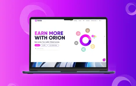
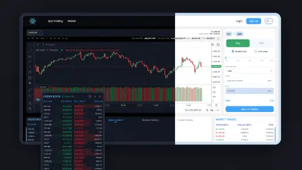
Quan2um mobile app
This is a mobile crypto exchange app developed by the Peiko team. Quan2um is a user-friendly solution for selling and purchasing Bitcoins and altcoins. We’ve thoroughly addressed the design aspect. During the prototyping phase in Figma, we aligned the design with contemporary trends and checked competitor offerings. Our specialists added a convenient wallet section featuring a comprehensive coin list, a candlestick chart, real-time transaction updates, and other functionalities for a smooth user experience.

Key mobile-first elements:
- Highlighted central features
- Responsive design across devices
- Improved page loading speed
- Typography adapted for different screens
By the way, you can check our portfolio to see more successful web and mobile designs crafted by Peiko. We also know how to build Telegram Mini Apps using top UX/UI design principles.
Our projects demonstrate how crypto solutions can apply these mobile first design principles to provide users with intuitive, accessible, and feature-rich smartphone experiences.
Challenges when implementing mobile-first design
The mobile first design presents a unique set of issues for designers. Unlike desktop design with its relative consistency, mobile design must navigate a diverse landscape of devices, performance limitations, and content prioritization dilemmas. This section explores the challenges that arise when prioritizing the mobile experience.

Variety in device landscape
Designers are confronted with many mobile devices, each having its unique blend of screen sizes, resolutions, and operating systems. Ensuring coherence and compatibility in this diverse landscape presents a formidable task. Striving for consistency across this spectrum requires meticulous attention to detail and a deep understanding of each device’s capabilities.
Performance optimization hurdles
In mobile design, users demand nothing short of lightning-fast loading speeds for websites and applications. However, achieving this feat is no easy task, especially in the face of sluggish Internet connections and the inherent limitations of mobile devices. Navigating these performance optimization challenges becomes imperative to uphold user satisfaction and loyalty. Prioritizing optimization strategies, from code minification to image compression, emerges as a critical endeavor to meet and exceed user expectations.
Content prioritization dilemma
The confined real estate of mobile screens presents designers with a formidable conundrum: how to select and prioritize content judiciously. Striking the delicate balance between delivering vital information and eschewing clutter is paramount to crafting a seamless user experience. Designers must meticulously curate content, ensuring that every element serves a purpose and contributes to the overall coherence of the interface.
Navigation complexity
Crafting intuitive navigation systems for mobile interfaces is a multifaceted challenge, exacerbated by intricate site structures and copious content volumes. Simplifying navigation while preserving functionality demands meticulous planning and rigorous testing. Designers must anticipate user behavior and streamline the navigation flow to facilitate effortless exploration and interaction.
Cross-platform uniformity issues
Ensuring consistent user experiences across diverse platforms, be it iOS, Android, or web – presents a formidable hurdle for designers. Balancing the need for uniformity with platform-specific design guidelines necessitates a nuanced approach. Designers must navigate this landscape with finesse, meticulously tailoring each interface element to align with the platform’s unique characteristics while maintaining a cohesive brand identity.
While the challenges inherent in mobile first web design are undeniable, they are not insurmountable. If you turn to an experienced web design services provider, they will craft mobile experiences according to the guide to successful cryptocurrency software design. You will obtain not only a functional software solution but also a visually appealing and user-friendly one.
Trends to expect in mobile-first design
Below, we will consider the most anticipated trends that will shape the future of mobile experiences. The majority of these trends have already been implemented and promise even more possibilities in the coming years.
- Augmented reality (AR) integration: With the surge in AR adoption, mobile first web design is poised to embrace more immersive and interactive experiences. AR features can heighten user engagement and offer unique value across diverse sectors like retail, education, and entertainment.
- Voice user interface (VUI) revolution: The proliferation of voice-controlled devices is reshaping user interactions with mobile interfaces. Mobile first design must adapt to accommodate voice commands seamlessly, enhancing accessibility and convenience for users.
- Artificial intelligence (AI) fusion: AI-driven features, including personalized recommendations and predictive analytics, are set to become ubiquitous in mobile-first design. Integration of AI capabilities promises personalized and contextually relevant user interactions, enriching the user experience.
- Gesture-based interaction innovation: As touchscreens dominate mobile devices, gesture-based interactions will gain prominence. Designers will explore novel applications of gestures for navigation, interaction, and content manipulation, fostering intuitive and immersive user experiences.
As technology continues to advance, we can expect even more exciting innovations that will redefine how we interact with the world through our mobile devices.
Peiko is your best choice for creating mobile first design solutions
Peiko is a trusted web, mobile, and blockchain development company. Our specialists consistently succeed in creating top-notch mobile-first responsive design solutions worldwide. We firmly believe that developing responsive and adaptive designs is crucial for the prosperity of our clientele.
Our mobile-first strategy stands at the forefront of our innovative methodology, tailored to meet our clients’ needs. We prioritize mobile design inquiries and solutions and streamline the design process for all other devices, making it simpler to shape and execute.
Bitcoin Additional is one of our best software development projects, and it has outstanding web design. It is a crypto wallet that is a top example of Peiko’s prowess in crafting cutting-edge mobile first design solutions. This crypto wallet provides seamless functionality and an intuitive interface that is pleasant to use on mobile devices.
Our task was to develop a mobile and tablet-adapted application design that elevates the user experience to new heights. Applying our expertise in mobile-first design, we meticulously crafted a user-friendly interface that fosters seamless interaction with other users. The result is a visually stunning and intuitively navigable application redefining mobile cryptocurrency wallets’ standards. Moreover, this app suits both skilled crypto enthusiasts and those new to the world of cryptocurrency.

In summary, Bitcoin Additional exemplifies Peiko’s great capabilities in a mobile-first design. Select Peiko as a partner for design and custom application development services and experience the difference firsthand. We are masters in creating mobile first design solutions that end-users like.
Conclusion: it’s time to get responsive for mobile apps
Given the current dominance of mobile devices in the market, adopting a mobile first design approach is not just a choice but a necessity. In 2024, businesses aiming to enhance their online presence and deliver optimal user experiences should prioritize mobile-first web design.
By implementing a mobile-optimized design strategy, you ensure your website is convenient, easily accessible, and user-friendly. This leads to increased engagement, improved conversion rates, and enhanced customer satisfaction. So, it is crucial to prioritize mobile-first web design to stay ahead in the ever-changing digital landscape.
At Peiko, we provide top web design services and can help you build great apps that are efficient and convenient to use on any device. Turn to us today to discuss your idea.
No comments yet. Be the first to comment!