















TL;DR: Crypto transactions cannot be reversed, so friction in crypto interfaces is a safety tool, not a flaw. Review screens, new-address checks, withdrawal delays and limited token approvals give users a chance to catch irreversible mistakes before they sign. The skill is placing friction only where risk is high and removing it everywhere else.
Fintech spent a decade teaching product teams to delete steps. One-tap payments, saved cards, instant transfers: every screen removed was a conversion won. Bring that instinct to crypto, and it backfires. When a transfer cannot be reversed, the step you deleted may have been the only moment a user could notice a typo, a wrong network or a malicious request. That is the core of crypto UX friction: in an irreversible system, speed and safety pull in opposite directions at specific points in the flow. This article covers why crypto differs from the rest of fintech, which friction patterns work, and how to tell good friction from bad.
What Is Friction in Crypto Interfaces?
Friction in crypto interfaces is any deliberate step, delay or check that makes the user slow down before an action. Not all friction is equal. Bad friction (confusing steps, repeated logins, vague error messages) costs time and gives nothing back. Good friction costs seconds and prevents a loss.
Picture a user sending funds to an address they have never used. Without a review step, one tap sends it. If the address was pasted from a poisoned history entry, the money is gone. With a review step, the user sees the full address, a “first time sending here” flag and the network, and gets one chance to catch the mismatch.
So the goal is neither less friction nor more. It is friction proportional to risk.
Why Crypto Needs Friction That Other Fintech Does Not
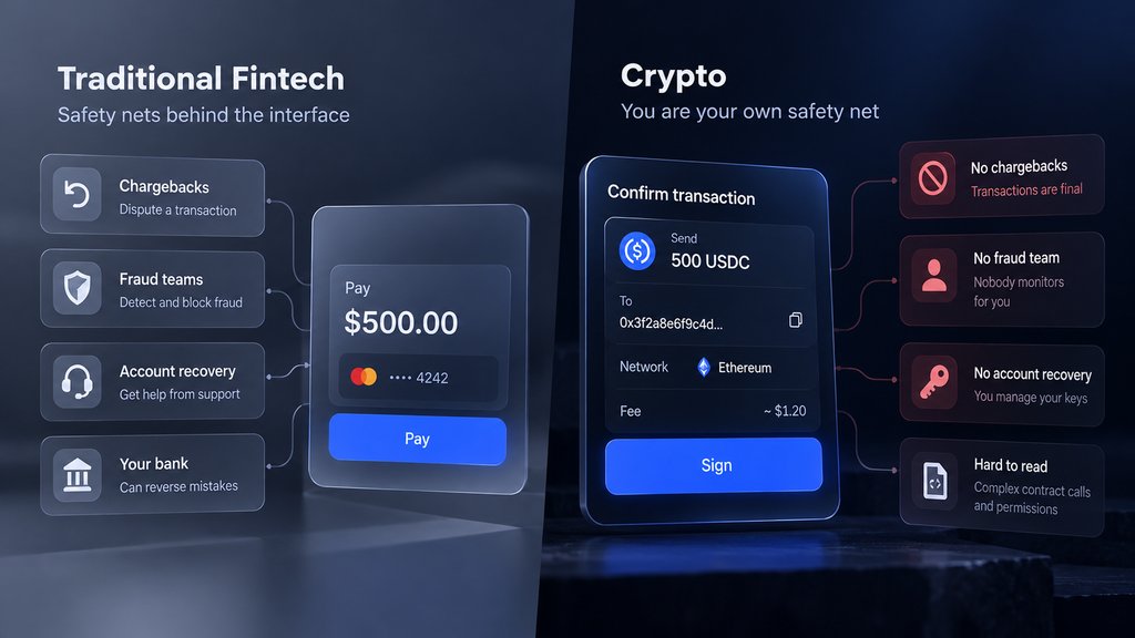
Most fintech can afford smooth flows because something sits behind them: chargebacks, fraud teams, account recovery. Crypto removes much of that safety net, which moves the job of catching errors into the interface. Four differences explain why.
1. Transactions are final
A card payment can be disputed; an on-chain transfer cannot. Once a transaction is confirmed, there is no chargeback and no bank to call. A mistake that would be a support ticket in traditional fintech is a permanent loss in crypto. For the interface, this means the last screen before signing carries more weight than any other. It is the final point where an error is still free to fix.
2. The user is their own bank
In self-custody, nobody watches transactions on the user’s behalf. There is no fraud team to freeze a suspicious transfer and no password reset for a lost recovery phrase. The interface is the only safety layer between the user and the signature. Every check the product skips is a check that simply does not happen.
3. Signing is hard to read
Users are often asked to approve hex data, contract calls and permissions they cannot interpret. Blind signing, approving a transaction without seeing what it does, is common in complex DeFi interactions. The interface has to translate: what leaves the wallet, who gets permission, and what changes after the signature.
4. The environment is adversarial
Crypto users face attackers who design for people in a hurry. Address poisoning seeds look-alike addresses into transaction history. Phishing sites copy real front-ends. Wallet drainers hide broad permissions inside routine-looking requests. Friction does not eliminate fraud, but it interrupts autopilot behavior at the moment of the attack, which is when the user can still notice something is wrong.
Where Friction Belongs: Five Patterns That Work
Good friction follows the user journey and appears at the moments where a mistake becomes permanent. The five patterns below run from the first transaction review to the recovery phrase backup. Each has a cost and a payoff; the point is to make that trade visible.
1. Transaction review and simulation
Users often sign transactions whose effect they cannot see. A review screen shows what leaves the wallet, to which address, on which network, and at what fee. Transaction simulation goes further: it runs the transaction against current chain state and shows the expected result, such as “you send 500 USDC, you receive about 0.2 ETH.” Put the plain-language summary beside the raw data, not instead of it, so advanced users can still verify. Simulation is a strong signal, not a guarantee: the outcome can differ if chain state changes before execution. Merchant and checkout flows need the same review logic; our article on payment gateway architecture covers that side.
- Cost to the user: one extra screen and a few seconds.
- What it prevents: blind signing, wrong-network transfers and fat-finger amounts.
2. Address verification and whitelisting
Address poisoning, clipboard malware and plain typos all end with funds at the wrong address. Crypto wallet UX can counter them with an address book, a clear warning on first use of a new address, and a check that flags addresses resembling a saved one. Show the full address in readable chunks instead of a truncated “0x12…ab3f”, because attackers generate addresses that match exactly the visible characters. Exchanges and custodial apps can add an optional whitelist, with a delay before a new entry becomes usable. Never prompt users to copy addresses from transaction history: that is where poisoned entries live.
- Cost to the user: a warning on the first send, a wait when whitelisting.
- What it prevents: sends to look-alike or mistyped addresses.
3. Token approvals and permissions
An unlimited token approval lets a contract spend a token balance indefinitely, long after the user has forgotten granting it. If that contract is malicious or later compromised, the balance is exposed. Good friction defaults the allowance to the exact amount the action needs, shows in plain language who can spend what, and makes revoking existing approvals easy to find. This is not only a DeFi issue: NFT marketplaces, bridges, games and payment flows request permissions too. Teams designing the smart contract layer can reduce the need for broad approvals at protocol level, which makes the interface’s job easier.
- Cost to the user: occasional repeat approvals for frequent actions.
- What it prevents: drainers exploiting stale or unlimited allowances.
4. Delays and cooling-off periods
An attacker who takes over an account through a SIM swap, a stolen session or social engineering usually moves funds at once. A time lock on withdrawals after a security change (new device, new withdrawal address, password or 2FA reset) breaks that sequence. Pair it with a notification to the user’s other channels so they can cancel. Make the delay configurable where possible: a short wait suits a casual user, a longer one a treasury account. For a related approach to withdrawal flows, see our article on watch-only withdrawals.
- Cost to the user: a wait at the moment they want their funds.
- What it prevents: fast drains after account takeover.
5. Recovery and backup checks
Users who skip writing down the recovery phrase lose access for good; users who store it carelessly hand it to attackers. Before the wallet holds meaningful amounts, ask the user to confirm the phrase by re-entering selected words or picking them by position. Warn clearly that support will never ask for it. Show the phrase only behind a context warning, with screenshot protection where the platform allows. Some products let users explore with a small balance first and require the backup check before larger deposits, which keeps onboarding light.
- Cost to the user: a minute or two during setup.
- What it prevents: permanent loss of access and phrase theft through fake “support”.
When Friction Becomes a Bug
Friction becomes a bug when it does not match the risk, when users cannot tell why it is there, or when it serves the platform rather than the user. Three failure modes show up again and again.
Alert fatigue. If every action triggers a warning, users learn to click through all of them, including the one that matters. Habituation turns a safety prompt into muscle memory, and the prompt stops doing its job.
Dark friction. Withdrawals buried three menus deep, fees revealed only on the last screen, exit flows built to wear users down. These are dark patterns dressed up as security, and users notice the difference.
Onboarding walls. Long forms, forced tutorials and setup steps placed before the user has seen any value. Some of these steps are required; the real question is whether they must come first.
The test below is our own framework for telling good friction from bad, not a research finding. Run any prompt in your product through all five questions.
| Test | Good friction | Bad friction |
|---|---|---|
| Proportional to risk? | Rises with amount, novelty and irreversibility | Same for every action |
| Explains itself? | Says what is being checked and why | Generic “Are you sure?” |
| Whose interest? | The user’s funds and decisions | Retention, upsell or platform liability only |
| Can the user act on it? | Offers a clear next step: verify, cancel or wait | Dead end with only “OK” |
| Does it age well? | Reviewed against override and error data | Added once, never measured |
A Friction-by-Risk Matrix for Crypto Interfaces
Secure crypto interface design starts with sorting actions by how much damage a mistake can do. The matrix below is a starting point, not a standard. Each product sets its own thresholds after looking at its user base and its loss data.
| Action | Friction | Typical pattern |
|---|---|---|
| View balances, browse, other read-only actions | None | No prompts; speed matters |
| Send a small amount to a saved or whitelisted address | Low | Single review screen with a clear summary |
| Send to a new address | Medium | First-use warning, full address shown in chunks, user confirms the first and last characters |
| Large transfer, new device, or any action after a security change | High | Extra confirmation (typed or second factor), optional time delay, notification to the user’s other channels |
| Grant a token approval or sign unreadable data | High | Plain-language permission summary, limited amount by default, clear warning for unknown contracts |
| Change recovery, security or withdrawal settings | High | Re-authentication plus a delay before new settings apply |
| Anything that exposes the recovery phrase | Maximum | Context warning, capture protection where the platform allows, never requested outside recovery |
What counts as “small” or “large”, and how long any delay lasts, are product decisions. There are no universal numbers.
How to Design and Measure Friction
Applying friction well is a process, not a one-off design decision. The four steps below move from mapping risk to pruning what does not work. They fit an existing product as well as a new build.
- Map irreversible actions. List every step where a mistake cannot be undone: sends, swaps, approvals, bridge transfers, security setting changes, recovery phrase exposure. Add the flows your support team handles most often. This list is the scope of your friction work. Everything outside it should be as fast as you can make it.
- Match friction to risk. Place each action in the matrix above. Routine actions get a single clear review screen. New addresses, large amounts and permission changes get stronger checks. Resist raising everything to “high” just to be safe; that is how alert fatigue starts.
- Explain, do not just block. Every prompt should say what is being checked and what the user can do next: verify, cancel, wait or proceed. Translate technical data into plain language. “Unknown contract requests unlimited USDC spending” is actionable. “Are you sure?” is not.
- Measure and prune. Track what each piece of friction actually does. If users override a warning almost every time and the error rate does not move, the warning is noise: rewrite it or remove it. If an error type persists, the friction sits in the wrong place.
Metrics worth tracking:
- completion rate by action type
- error and wrong-address rate
- support tickets about lost or misdirected funds
- override (“proceed anyway”) rate per warning
- time to complete each flow
- funds-at-risk events caught before signing
Conversion alone is the wrong yardstick for protective friction. A drop in completion on a risky action, such as an unlimited approval to an unknown contract, may be exactly the result you wanted.
When the Interface Has to Show Dense Data
Friction on top of an unreadable screen is a ritual, not a safeguard: users cannot review what they cannot read. Clarity comes first. Design partner Masterly worked on this problem for a crypto risk analytics product:
Alterscope, a Munich-based risk analytics platform for crypto markets, came to Masterly with a working alpha and three weeks before an investor presentation. Masterly ran a UX audit, redesigned the product and built its design system in that window, making dense risk data readable without hiding it. Alterscope went on to raise from IOSG Ventures and Zee Prime Capital.
The full Alterscope case study describes the project.
What Comes Next
Three shifts are likely to change where friction sits. Treat them as expectations, not facts.
- Expectation: signing gets more readable. Pre-signing simulation is likely to become standard, and signing formats that carry human-readable intent should leave less room for blind signing.
- Expectation: friction moves into policy. Smart-account features such as spending limits, session keys and social recovery let users set rules once instead of confirming every action.
- Expectation: friction becomes adaptive. Fixed steps are likely to give way to risk-scored friction that rises with amount, novelty and context, and stays out of the way for routine actions.
The direction is the same in all three: fewer prompts overall, stronger ones where they count.
Build Safer Crypto Products with Peiko
Peiko builds wallets, exchanges and Web3 products, and can help product teams find the irreversible moments in their flows, apply friction where it protects users and remove it where it only costs conversions. The work starts with the questions in this article: which actions cannot be undone, what users actually see before they sign, and how you will know whether a warning works. For custodial platforms, the same approach carries into cryptocurrency exchange development, where account-level controls add options a wallet does not have. Planning a wallet? Start with our crypto wallet development team.
No comments yet. Be the first to comment!